Progressive
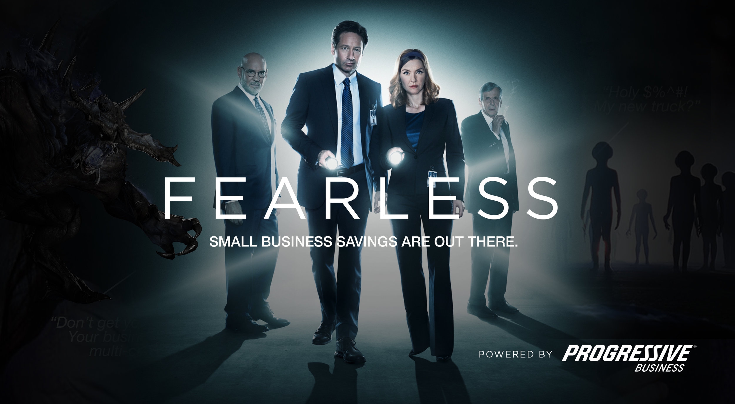
Fearless Campaign
Progressive Commercial tasked Harte Hanks with developing a direct marketing campaign that would drive prospect awareness and consideration of its various business insurance policies. Working closely with my copywriter to create a cohesive visual and messaging strategy, I started developing a mood board, ad lob and a series of innovative execution examples for both print and digital. Our goal? To face fear and defeat it by exemplifying the resilient spirit of small business owners in fantastic, monster-riffic scenarios.
After two different presentations in which the client narrowed down the concepts from 4 to 2, and then 2 to 1, Fearless was selected as the winner. This creative approach is now being further developed as part of the comprehensive awareness campaign for both engaged and unengaged prospects.

Fearless Mood Board
CAMPAIGN MANIFESTO
No one sees things the way you do. Being a leader has made you agile, flexible and dedicated to insuring the survival of your business. You trust your instincts and take bold steps to determine your fate.
You’re too busy to be scared. Other people might underestimate your strength, but at Progressive we value your ambition. If you’re ready to rise up and achieve your goals, we’re eager to bring our power, insight and confidence into your battle plan. Be fearless in the face of anything with a partner who supports your pursuits and honors your passions.
Be Fearless. Arm yourself with protection from Progressive, pick up your tools and do not go gentle into that good night.
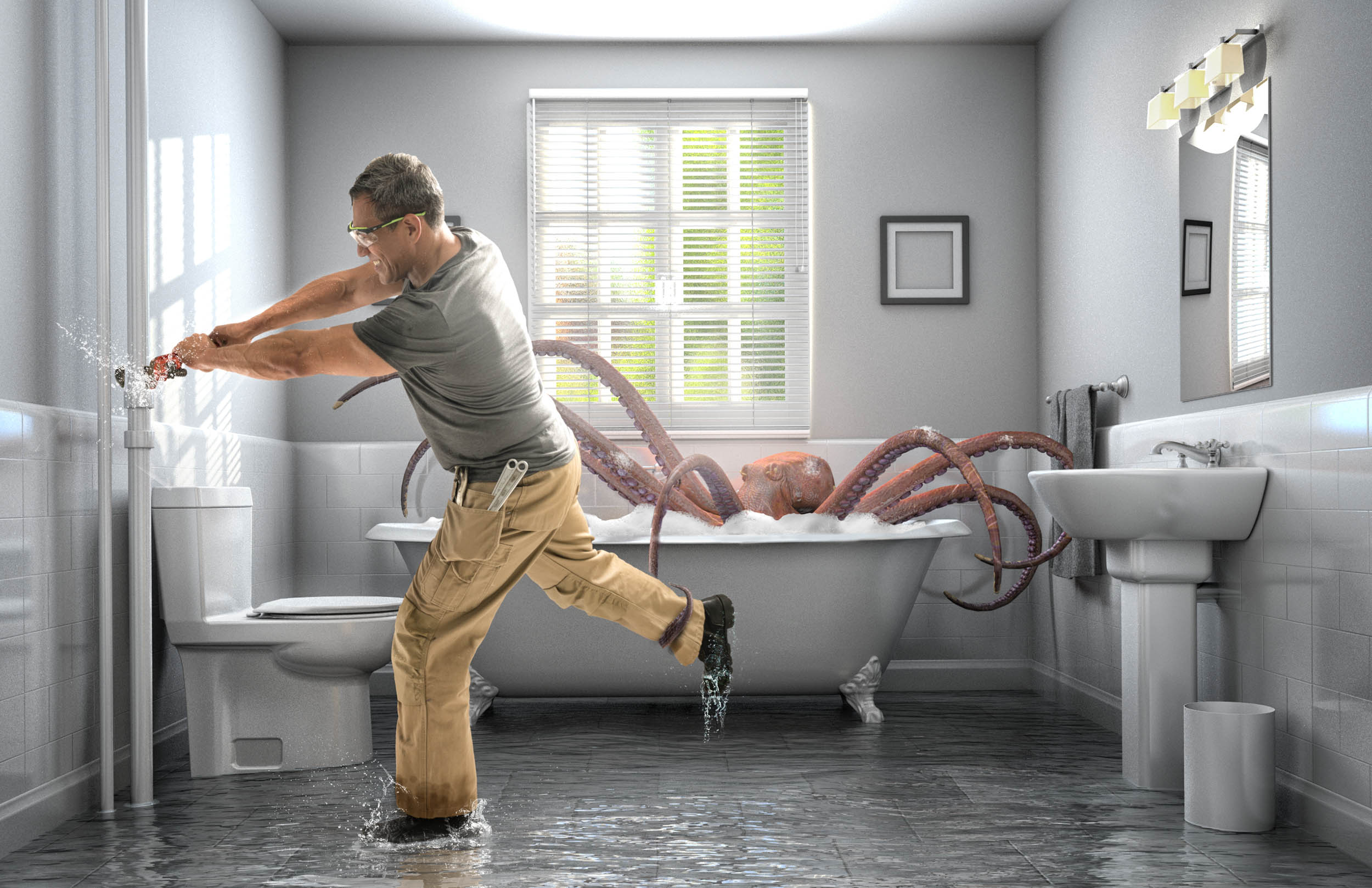
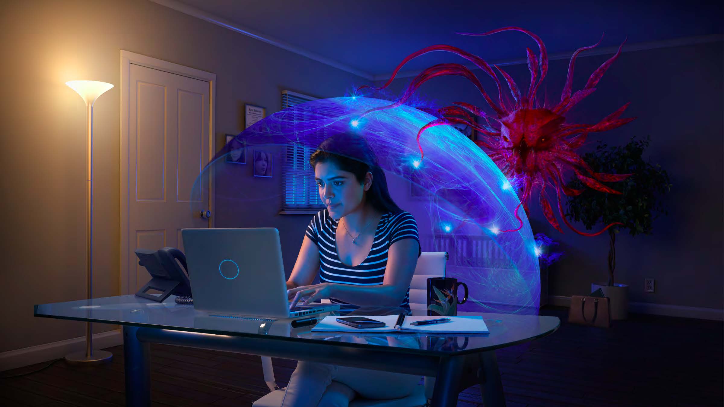
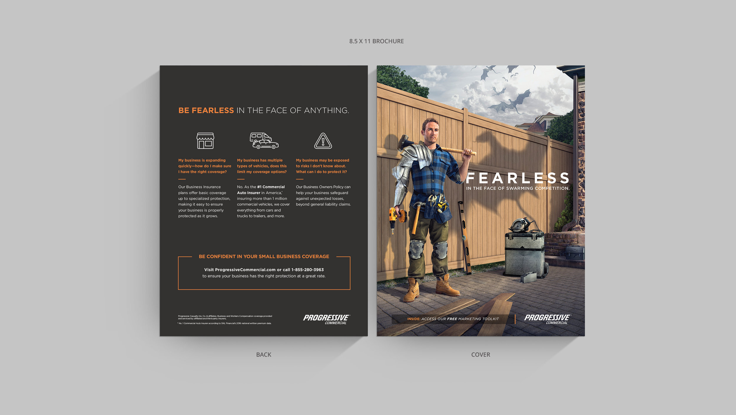
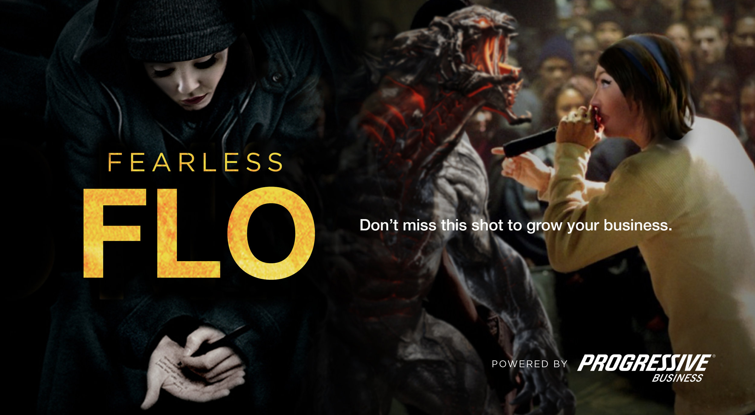
Ad Lob #1: Fearless in the Face of Monster Leaks
Inspired by deep sea tales of the mythical kraken, Monster Leaks features one of Progressive's primary customer groups: plumbers.
This immediately plays into the prospect's mindset by making them feel empowered, strong and considered the unstoppable hero of their small business.
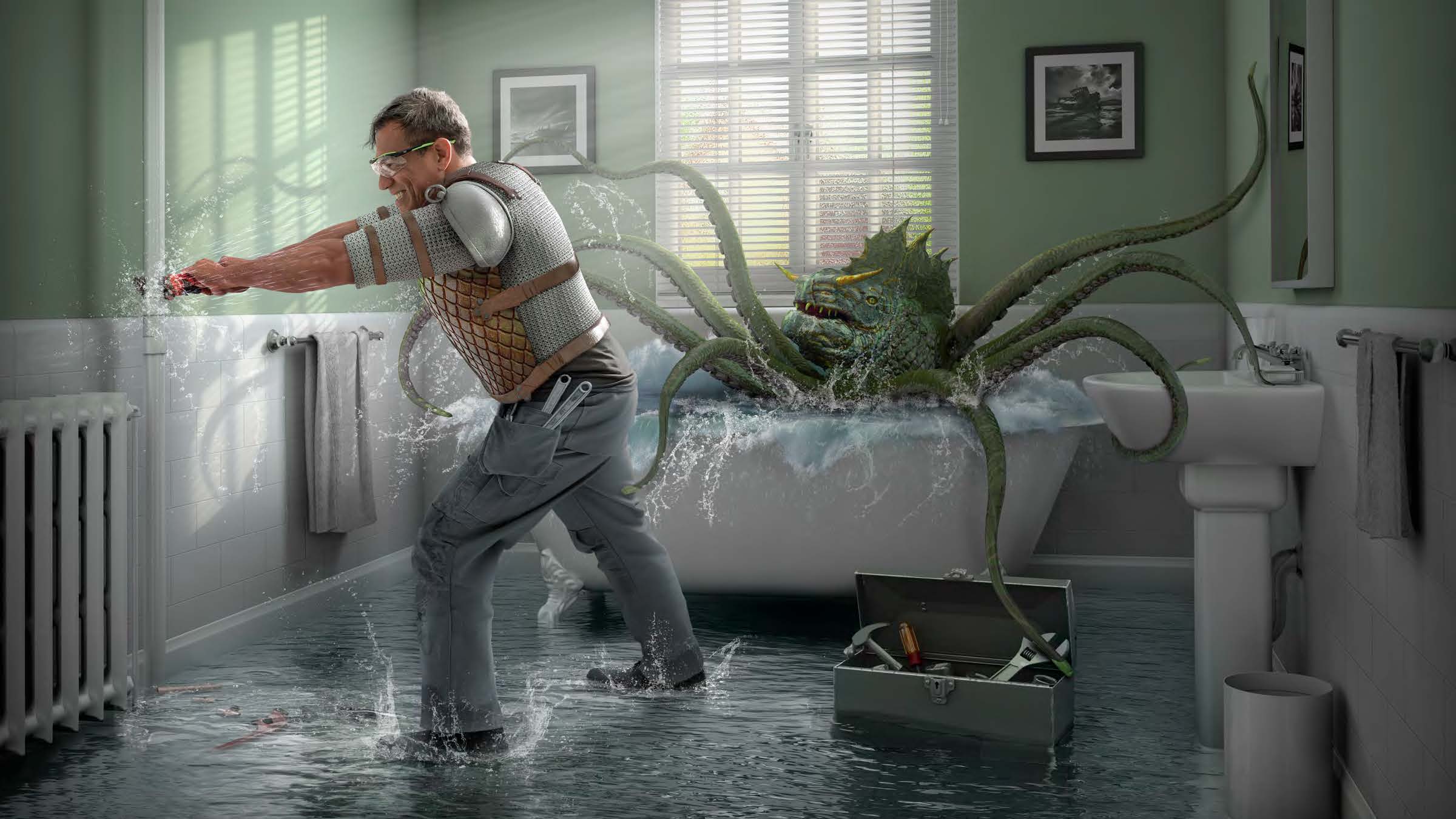
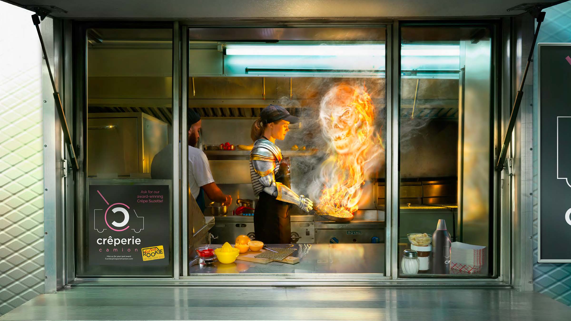
Ad Lob #2: Fearless in the Face of Flame and Fortune
Taking an unexpected approach to traditional dragon imagery, Flame and Fortune powerfully combines reality and fantasy.
By showing close-ups of the chef holding his "tools," we portray the everyday life of a business owner, while alluding to the customized tools and protection options that Progressive offers.

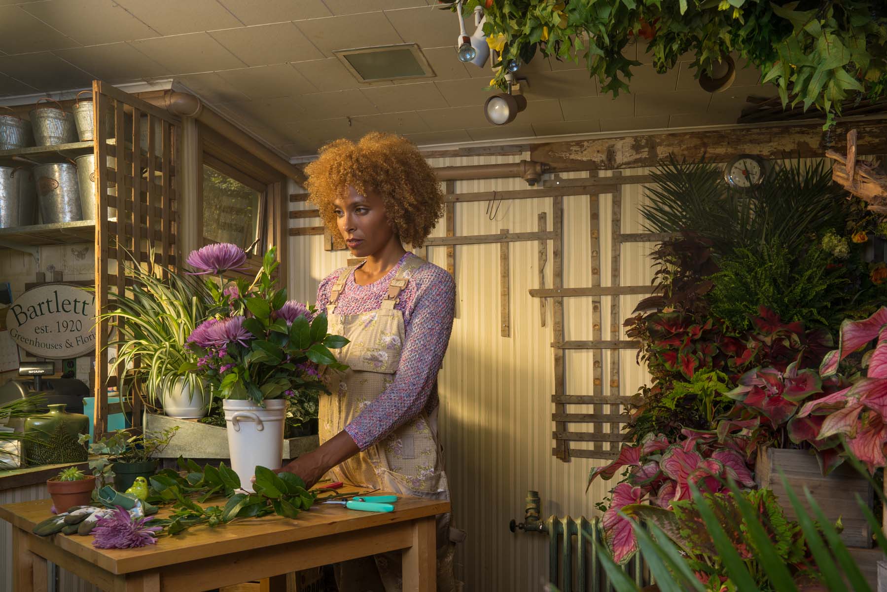
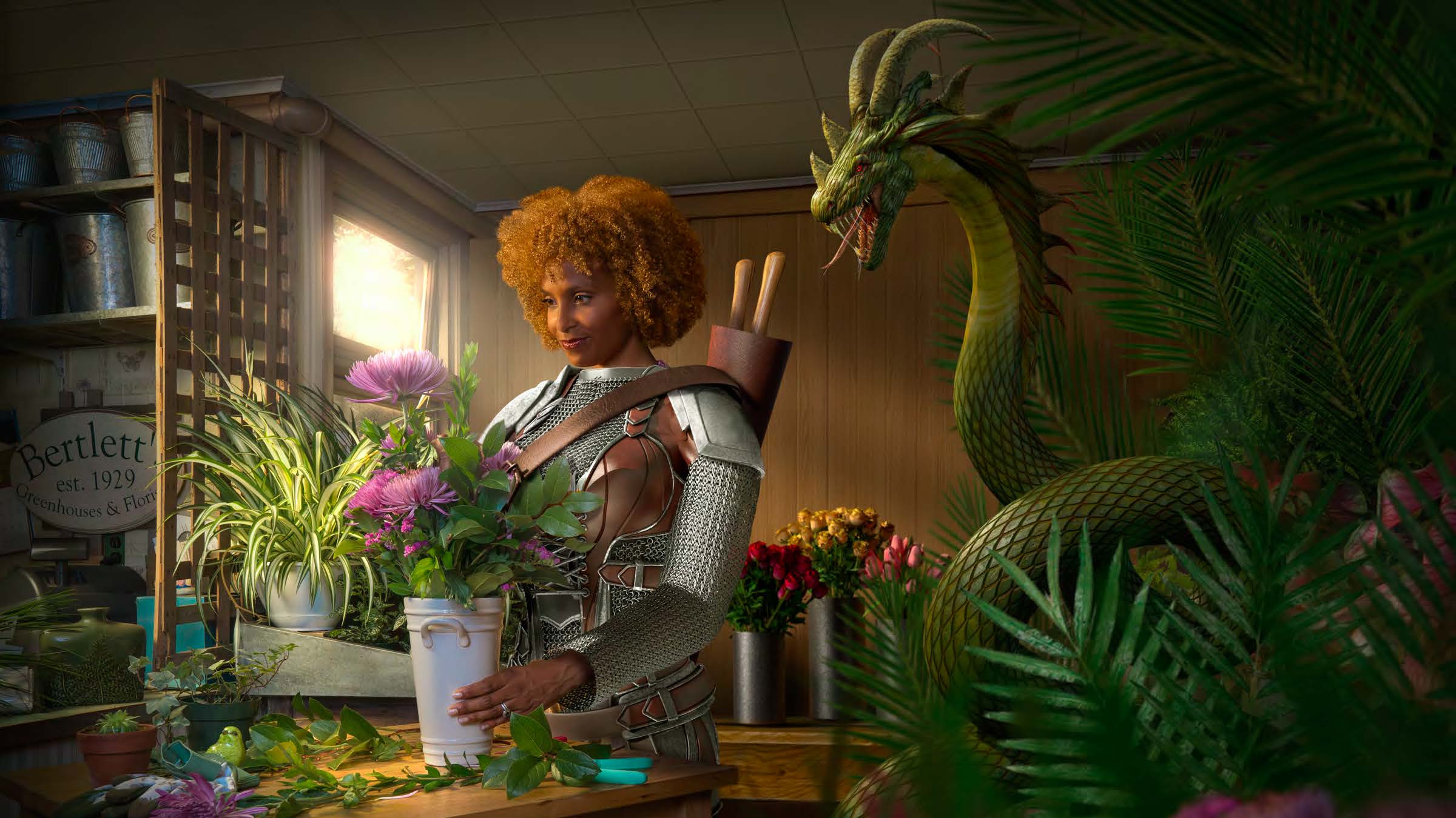
Ad Lob #3: Fearless in the Face of a Full House
Featuring the business owner as a monster, Full House shows how the campaign could evolve beyond just illustrating pure fantasy.
By reimagining business owners as fearless heroes, we make prospects feel bold, strong and confident–while giving them a renewed sense of purpose.
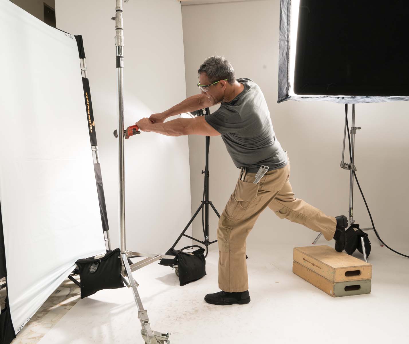
FEARLESS PHOTO SHOOT

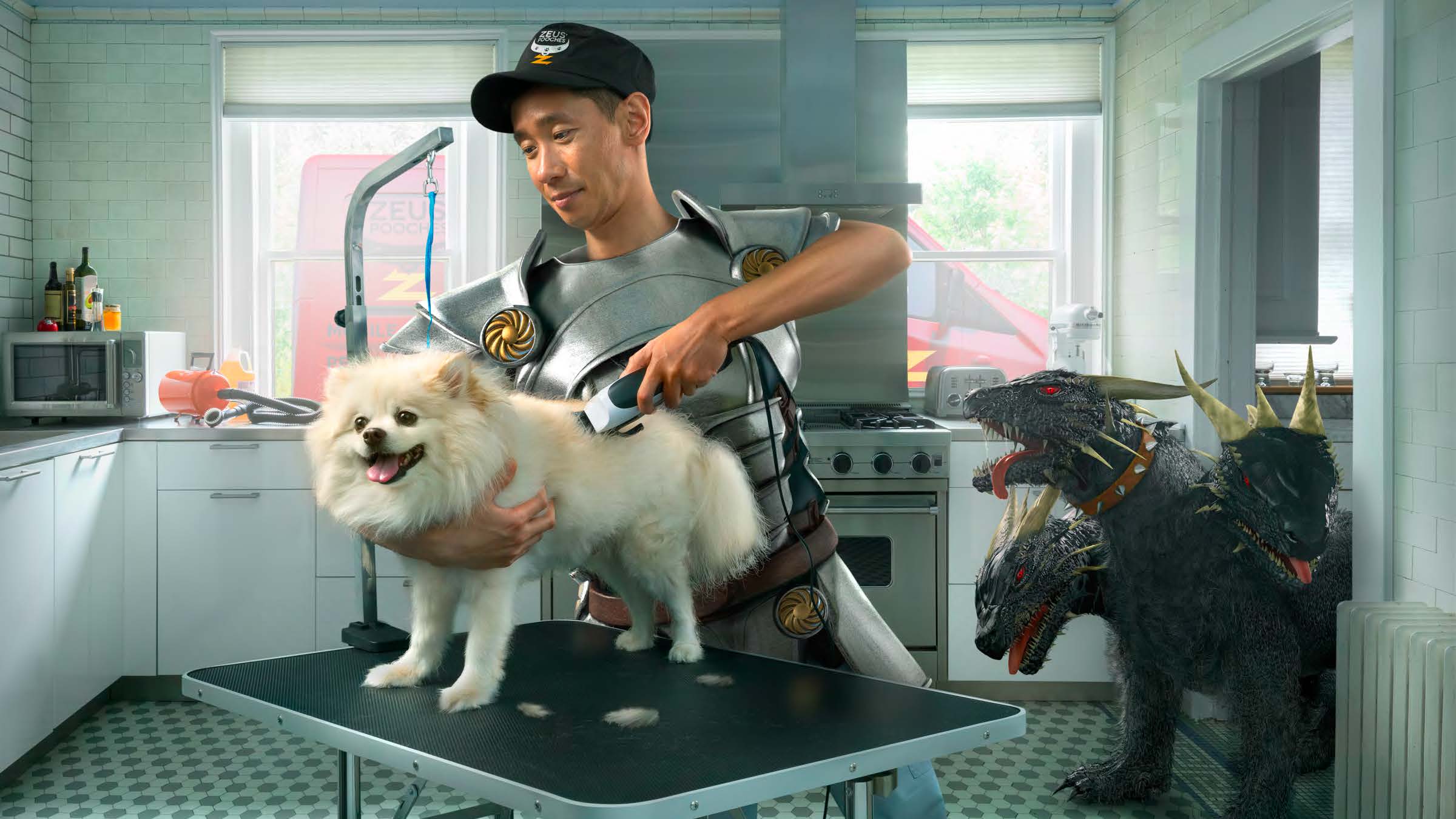
Ad Lob #4: Fearless in the Face of Hairy Hounds
Elevating the campaign even further, Hairy Hounds creates an opportunity to have the business owner interact with the monster.
This approach illustrates that even during moments of difficulty, Progressive can provide small business owners with the tools they need to overcome any obstacle.
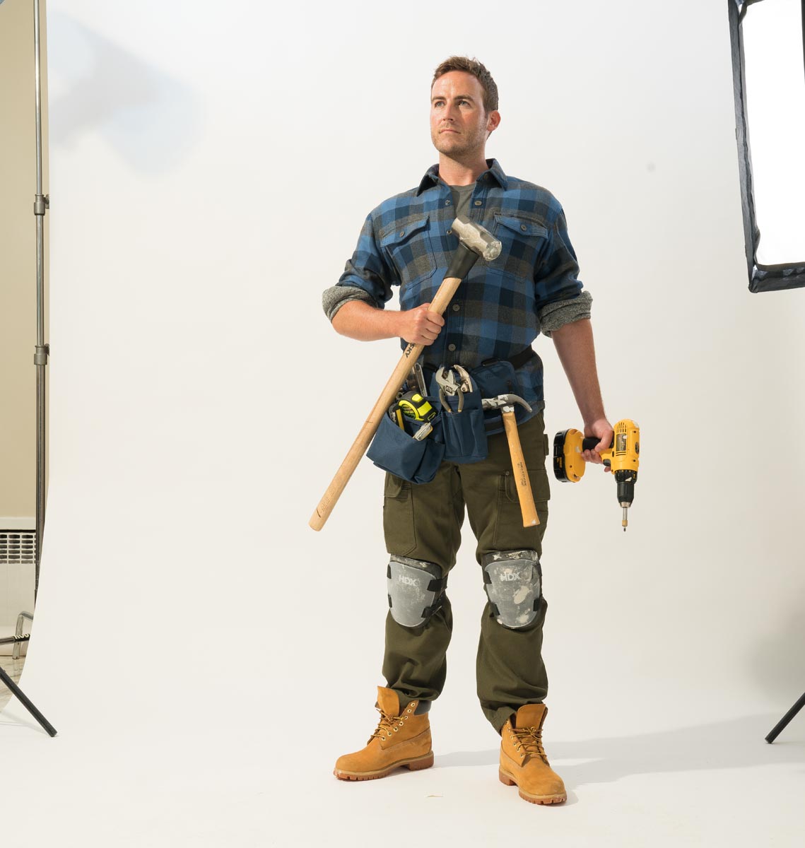
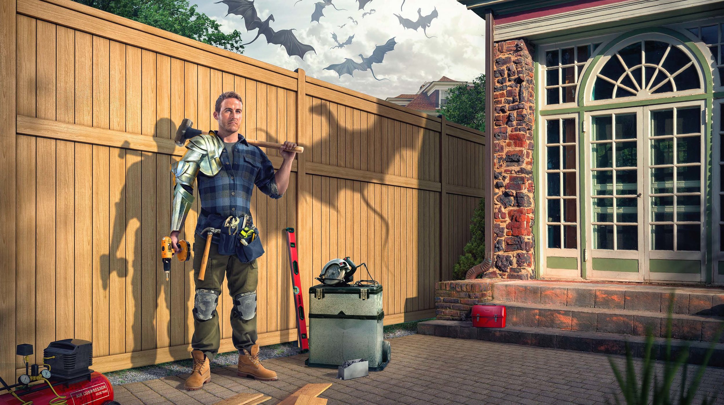
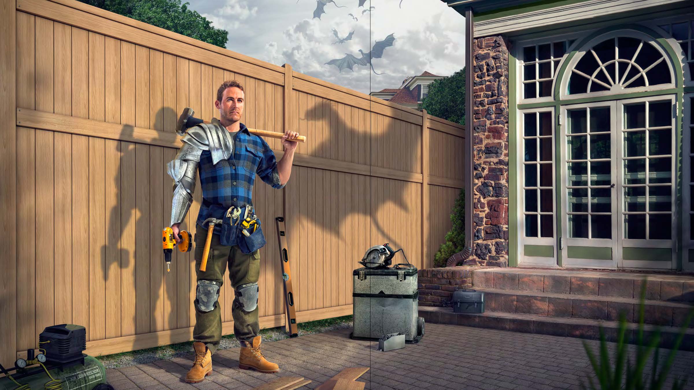

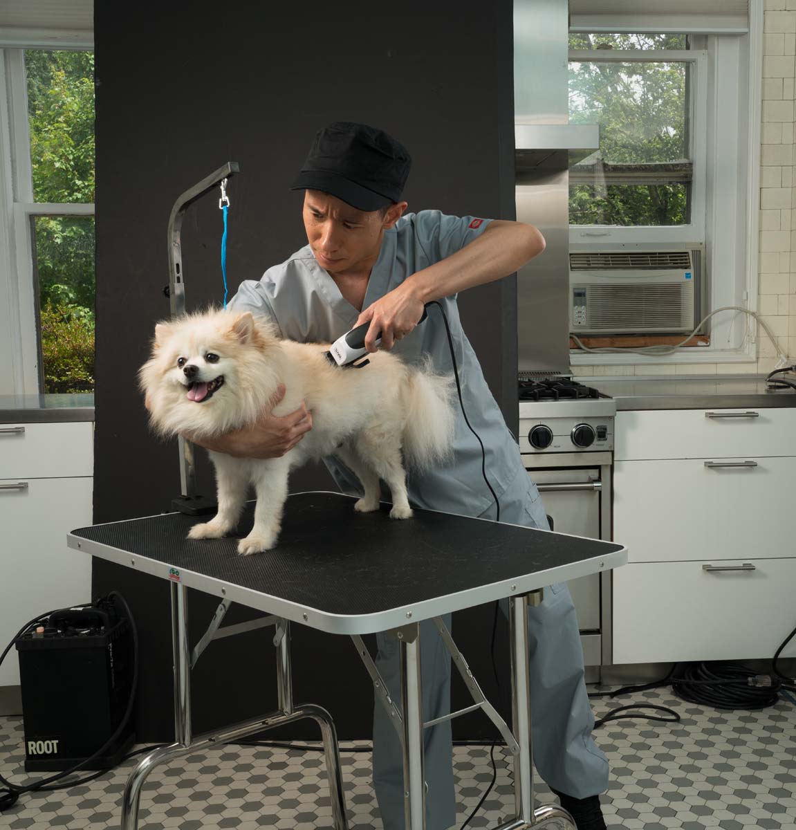
Shot in New Jersey by photographer Chris Clor.
DIRECT MAIL CONCEPTS
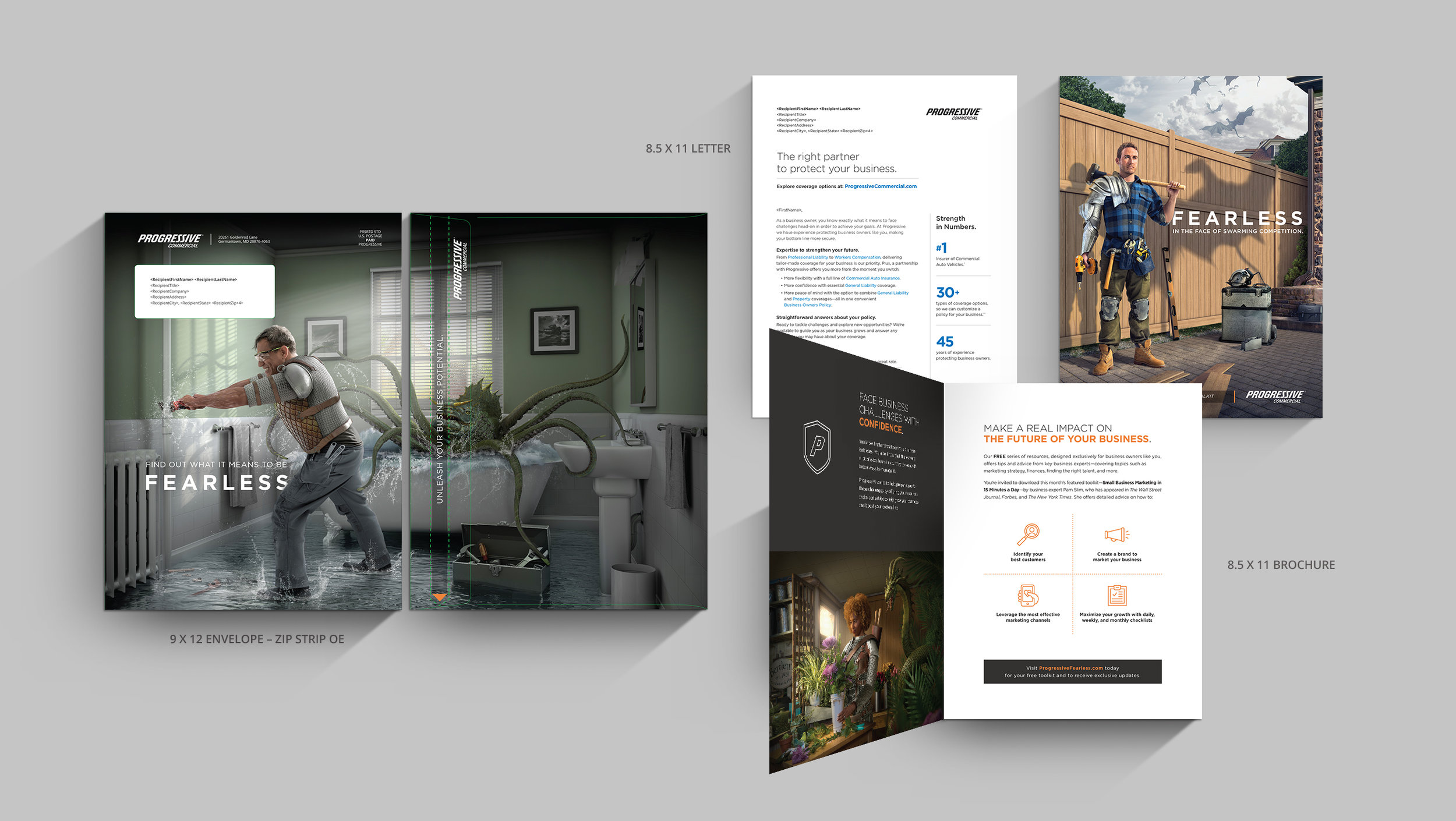
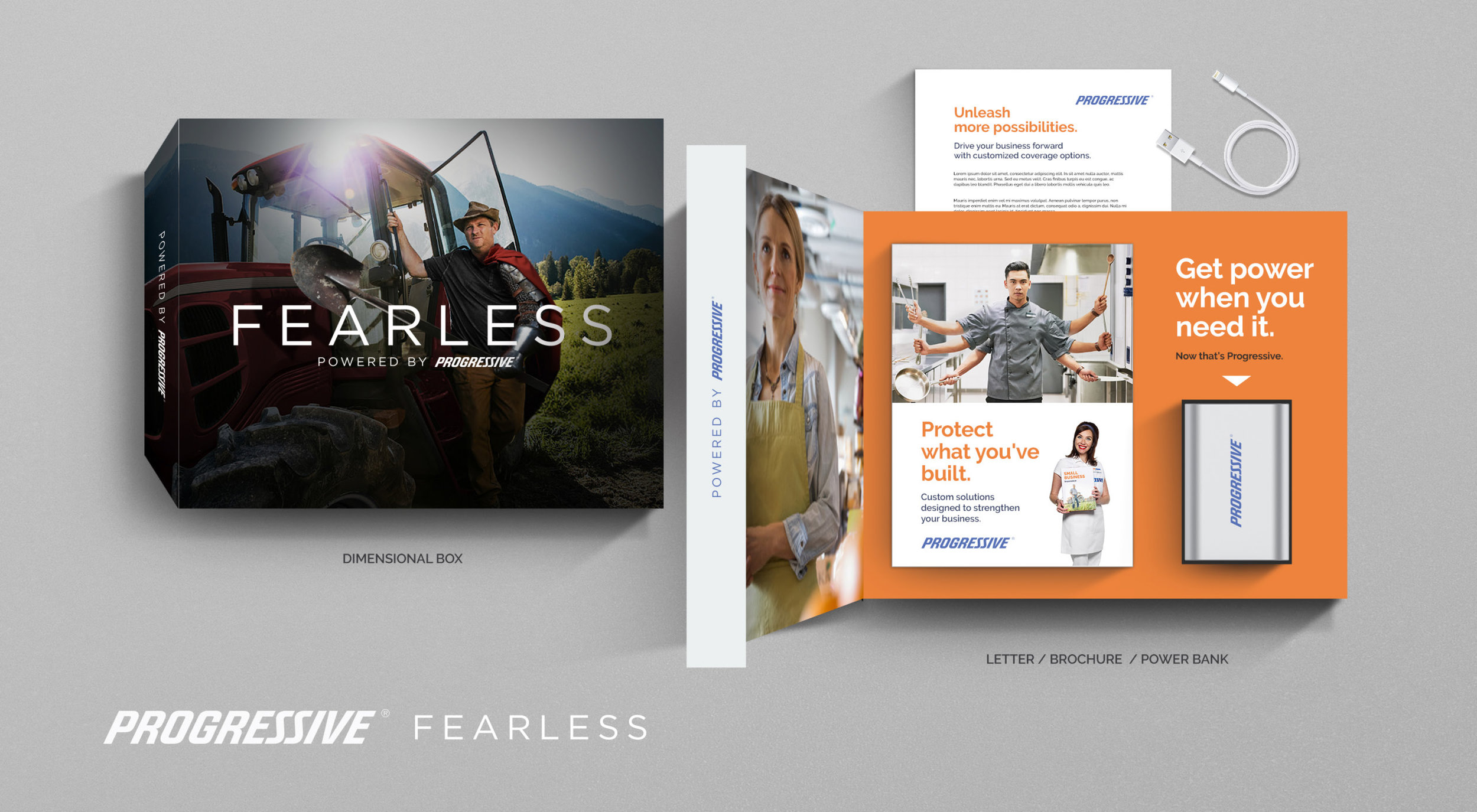
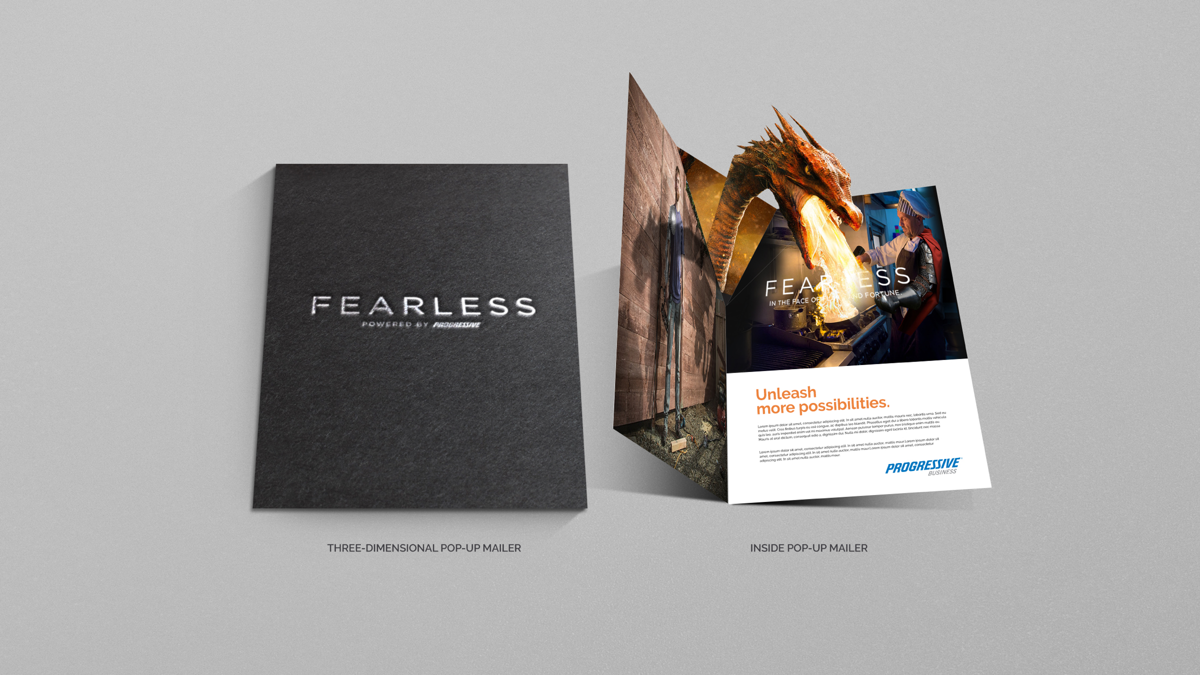
DIRECT MAIL KITS
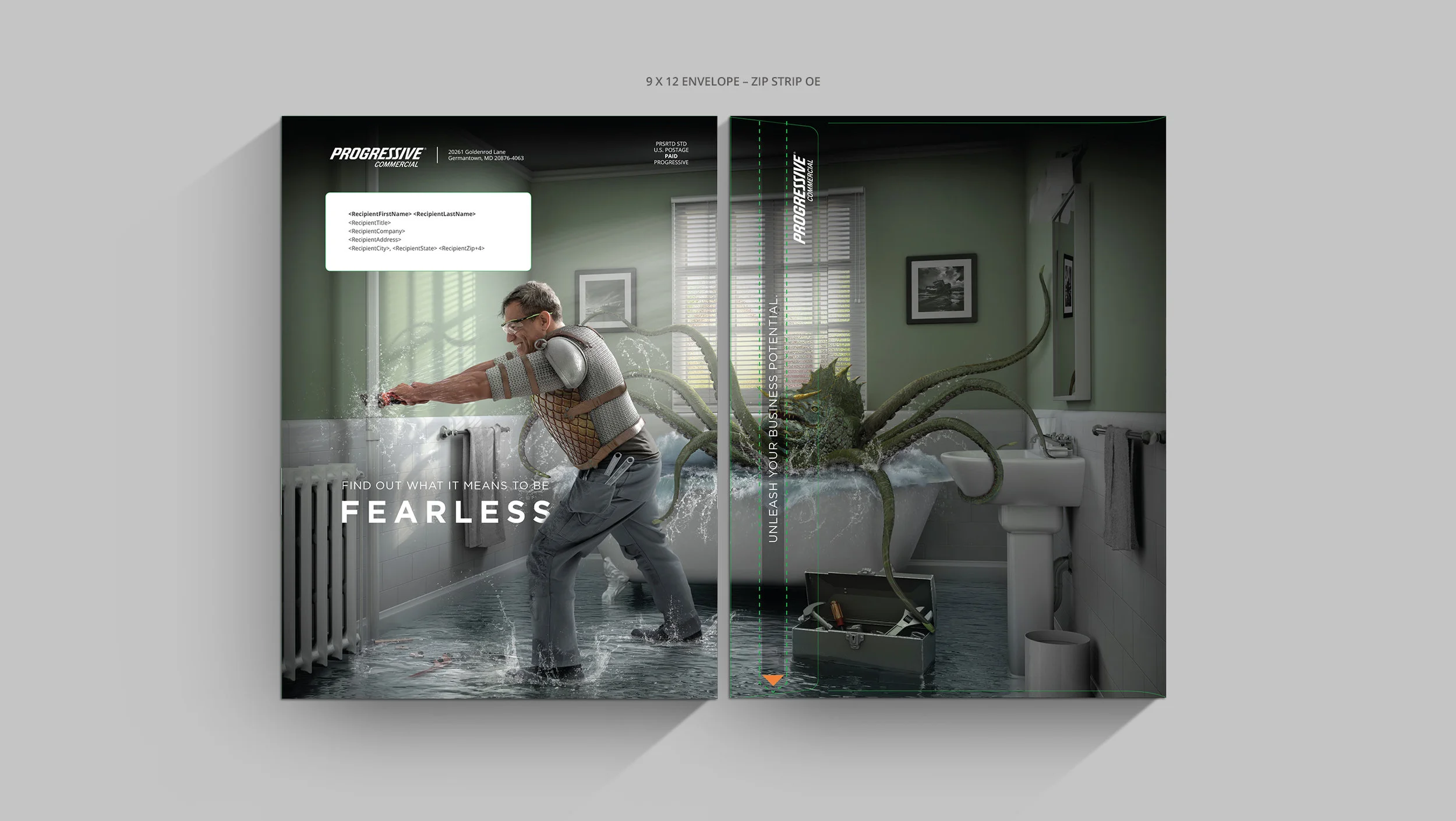
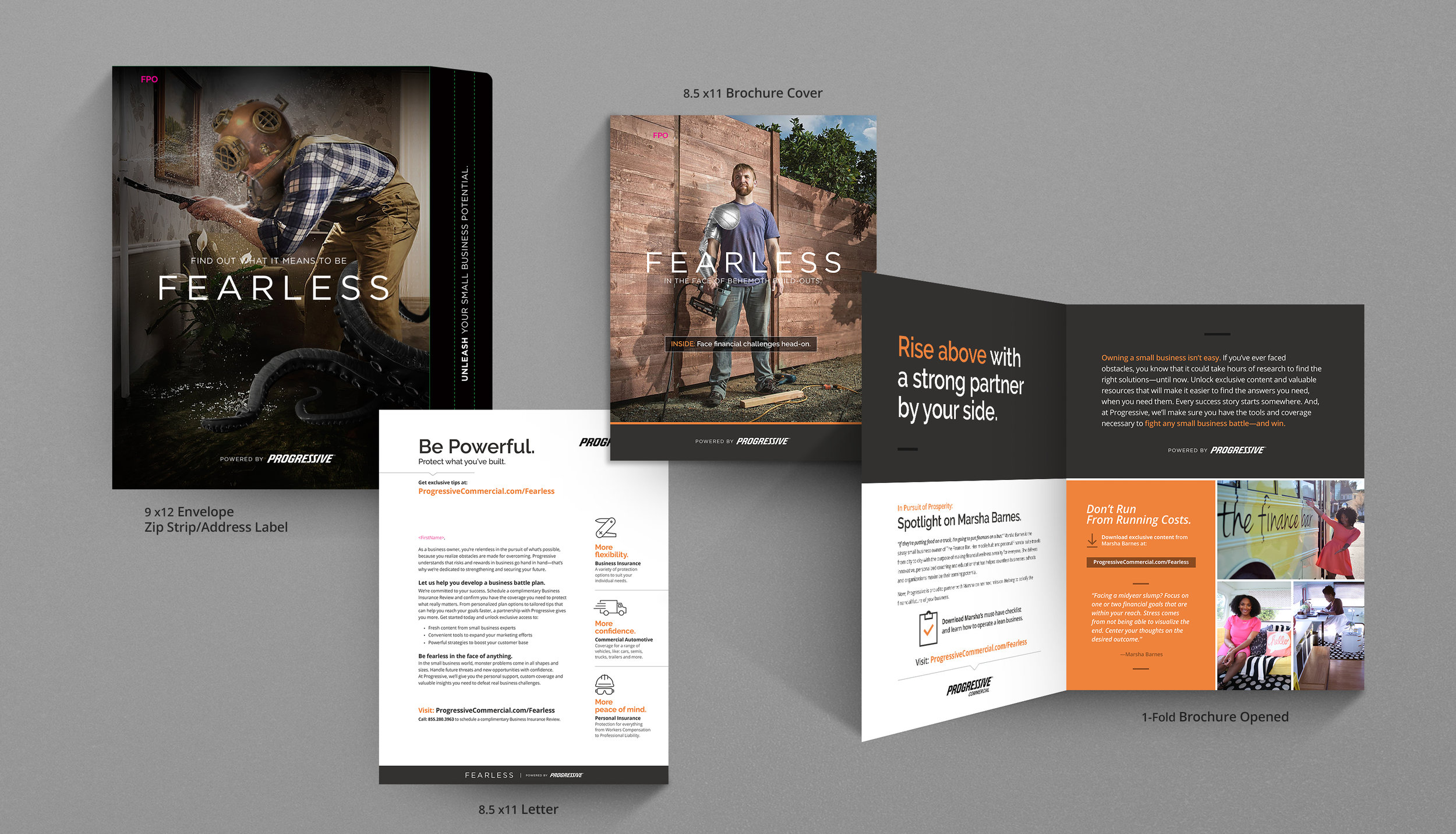
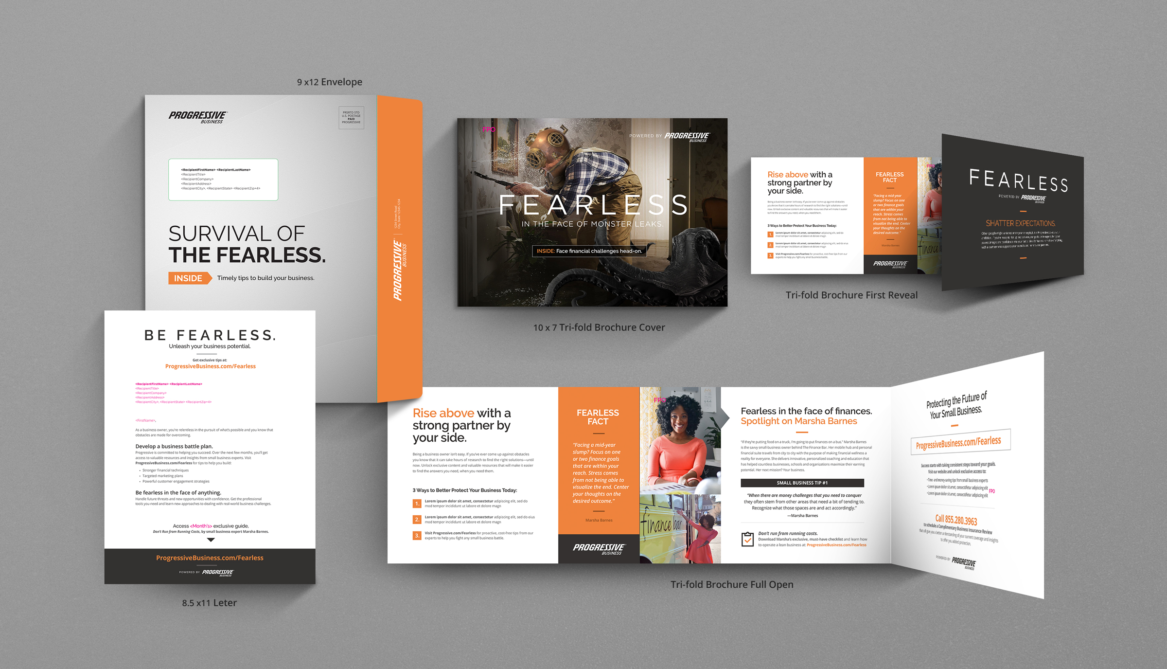
DM Touch 1 for Fearless was designed to tease the upcoming campaign by sending a cohesive message using disruptive copy and unexpected design elements. Progressive is a brand that is known for taking bold approaches to its advertising, and Fearless immediately steps up to the plate and into the small business prospect’s imagination.
Originally delivering two takes on a 9 x 12 OE, both the metallic and (selected) full-bleed Fearless image options would stand out in the mail for their size and non-traditional appearance. The headline “Find Out What it Means to Be Fearless” immediately piques interest and encourages them to open the kit. The subhead “Timely tips to build your business” goes on to provide the prospect with an instant answer to the question “What’s in it for me?”
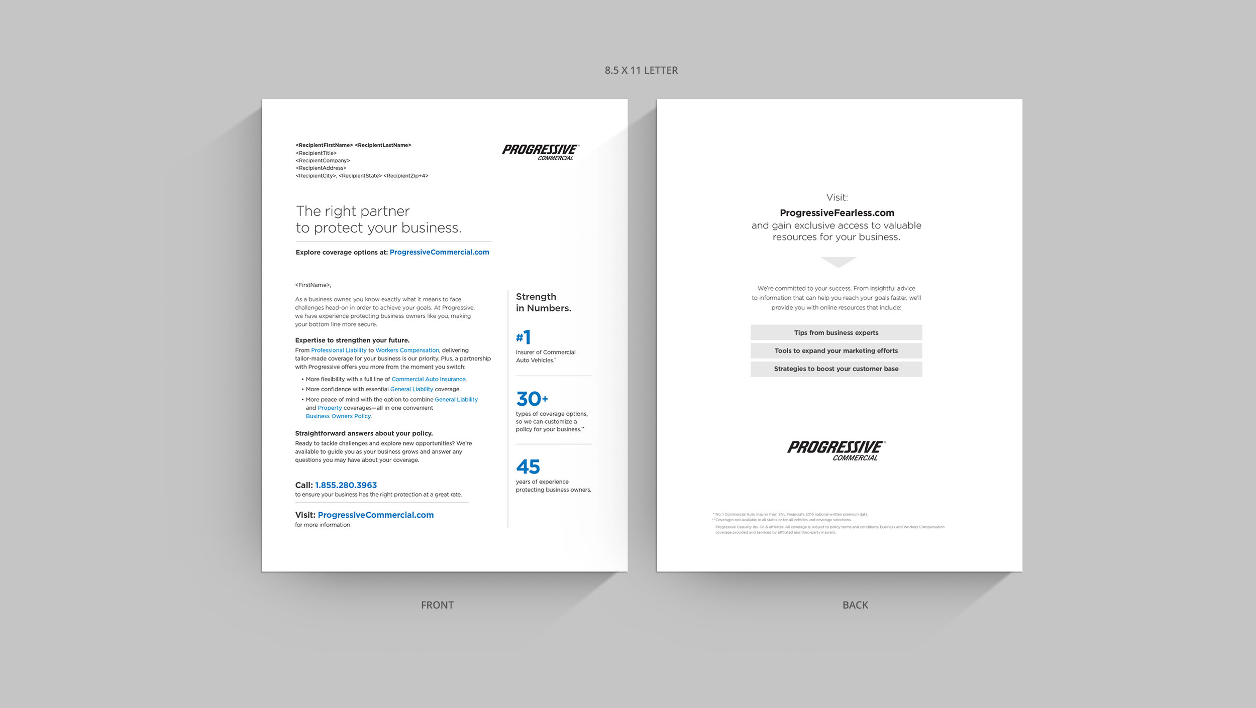
The 8.5 x 11 letter is scannable, succinct and provides plenty of white space for easy readability. We immediately introduce the strong Fearless concept language in the body copy and subheads to create a unified tone. Direct bullet points explain why the prospect should go to the landing page for additional content that can help them boost their business. Straightforward sidebar elements hit on the benefits of working with Progressive, while serving more as an awareness message than specific sales pitch.
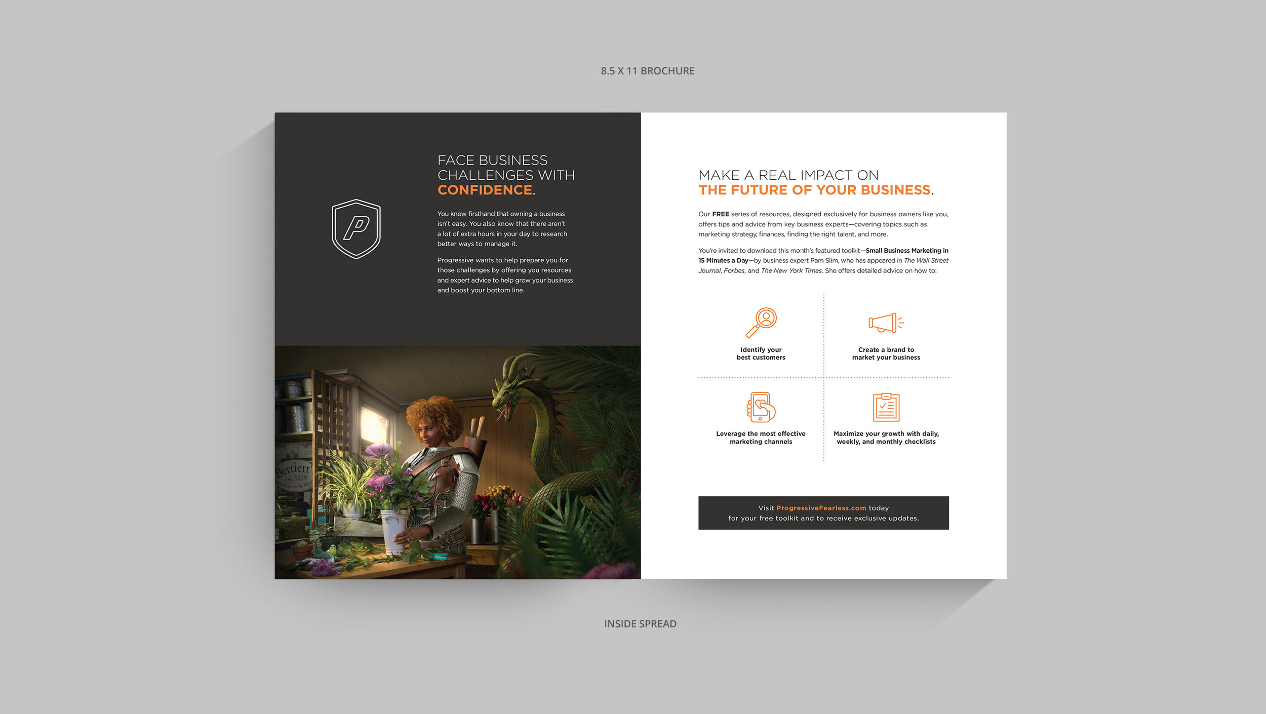
The 10 x 7 trifold brochure uses FPO’d imagery / headlines and will be updated with photos from the upcoming shoot. The back CTA panel summarizes the main reasons to visit the landing page and subtly teases the offer. The inside spreads are designed to give the prospect a taste of the type of informative resources that will be available to them on the landing page (3 Ways to Better Protect Your Business, Marsha’s Financial Tip) and gently introduces the benefits of partnering with Progressive.
EMAIL CONCEPTS
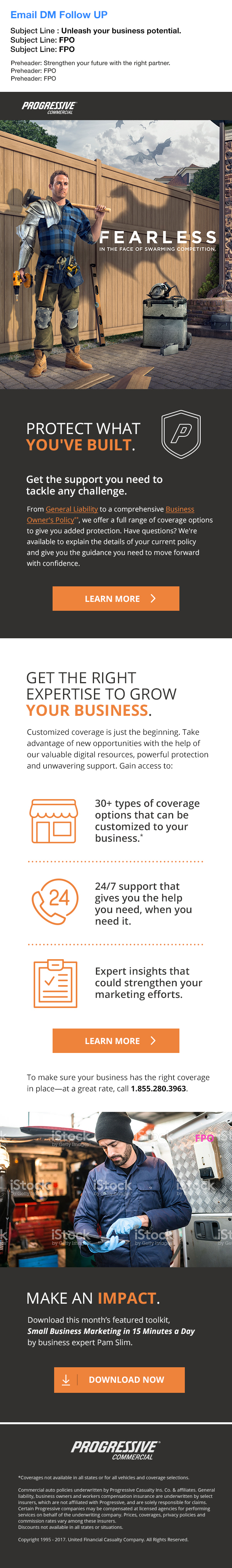
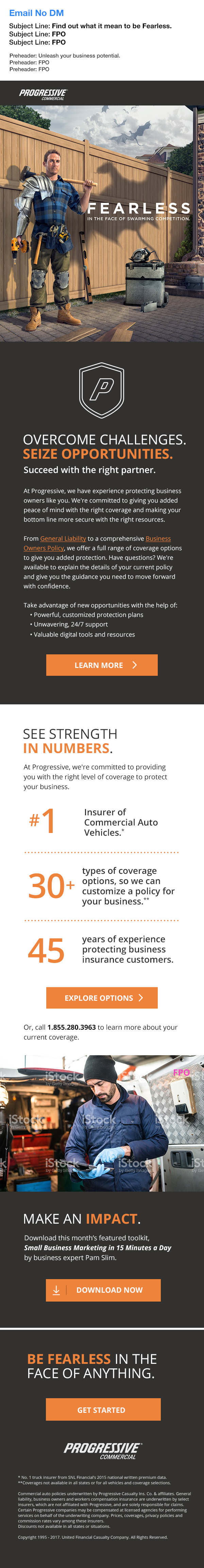
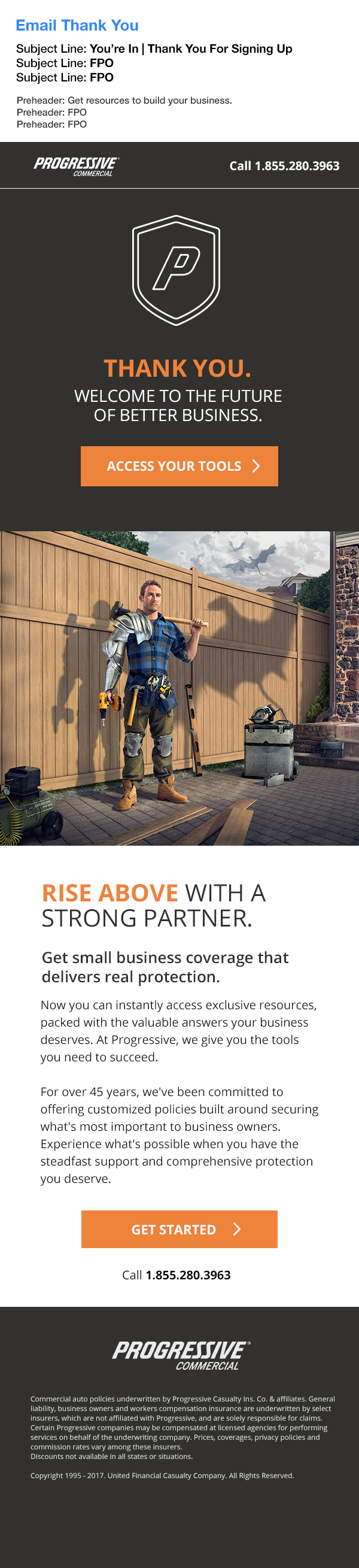
EMAIL CONCEPTS
We developed three email touches for DM-recipients, non-DM recipients and a Thank You to website sign-up prospects. Each was designed to be:
Scannable... The structures take a clean, modular approach and use Fearless imagery and modern iconography to encourage the prospect to scroll down the design. Large Fearless Hero images will command attention, while bold CTA buttons are direct and clickable.
Inviting... The layout and aspirational copy motivate the small business owner to take action and get insights that can help build their business. Mobile-friendly email versions will have a simple “click to call” button in place to encourage faster conversions.
Targeted... The headlines and CTA’s in each email use engaging copy and large targets to give the prospect clear next steps. Variable content areas can be updated based on the latest featured influencer content and gives the SBO additional reasons to visit the LP.
LANDING PAGE – UNENGAGED/ENGAGED
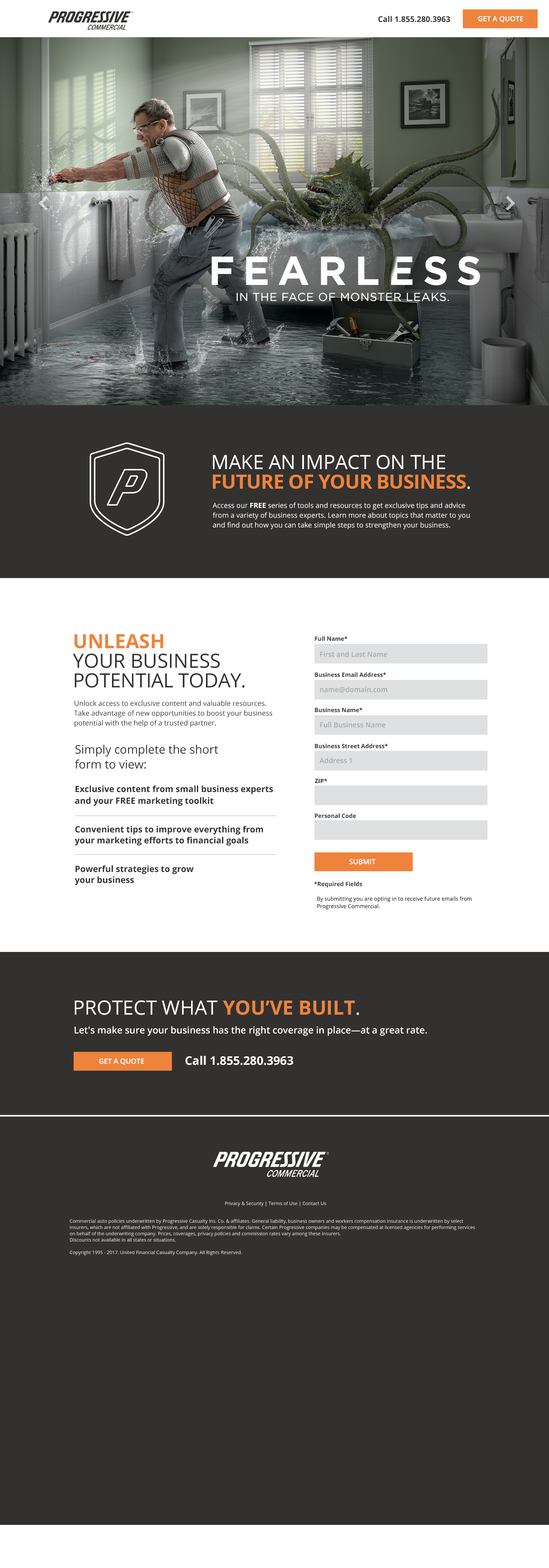
UNENGAGED LANDING PAGE
The LP approaches further distinguish the Fearless campaign by making use of large visuals, a parallax approach and scannable content areas. Using big Hero imagery and typography animation we will bring the Fearless story to life in a visually-dynamic way. The type, images and icons will animate on different layers throughout the home page to give the viewer scannable bites of information that is easy to process. Our Fearless imagery invites the SBO to scroll, discover more engaging content and ultimately take action by filling out the short form. Bottom footer sections are stackable to accommodate any additional tertiary content.
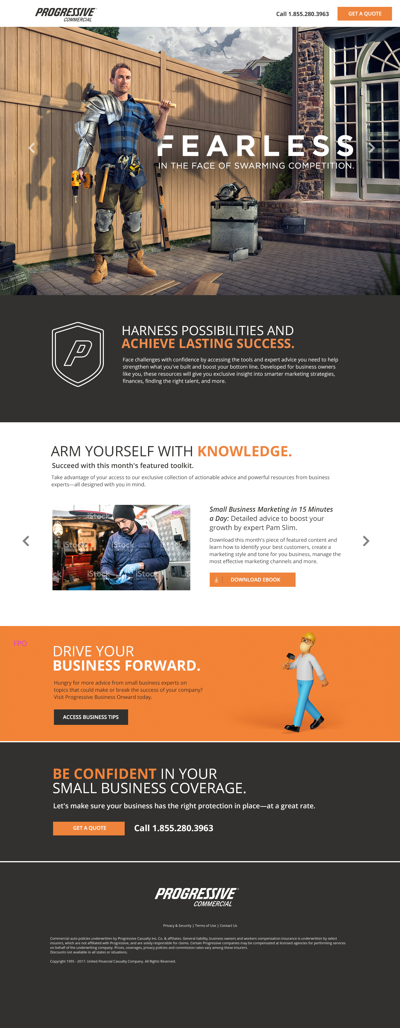
ENGAGED LANDING PAGE
Both versions further introduce the campaign as a whole, while blending smart, dynamic content areas with more of the Fearless imagery. Sticky navigation will follower user down the page so the “Resources,” “Expert” and “Contact” pages can be accessed any time during the scroll. Larger modular sections can animate tointroduce influencers or content using clean design elements. The layout and copy was designed to appeal to both readers and scanners. To help motivate the SBO to interact with our resources, each approach brings the story to life and clearly drives the prospect towards our primary calls to action.
SPEC CREATIVE EXECUTIONS
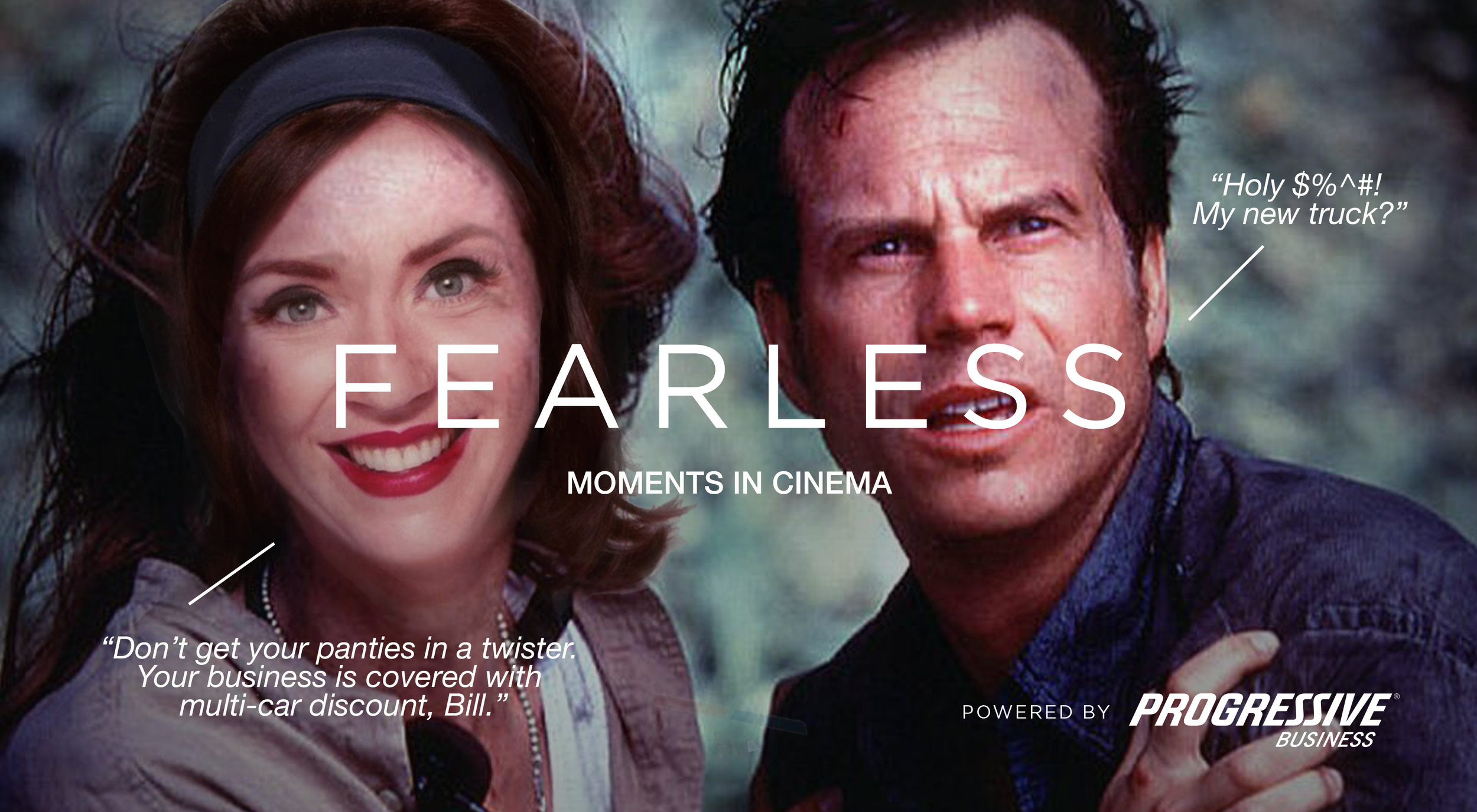
Spec Creative Executions
The following is placeholder text known as “lorem ipsum,” which is scrambled Latin used by designers to mimic real copy. Maecenas non leo laoreet, condimentum lorem nec, vulputate massa. Quisque congue porttitor ullamcorper. Sed a ligula quis sapien lacinia egestas. Donec ac fringilla turpis. Donec ac fringilla turpis.